Purple Pyjamas
/ click an image to view gallery


Project outline
Purple Pyjamas helps businesses, social enterprises and not-for-profits achieve change. Their services include professional facilitation, idea generation and evaluation, problem-solving, change management, business development and enterprise growth.
With purple as my client Vickie’s favourite colour and purple in the business name, this colour was a given when developing the logo and visual identity. However, I didn’t want purple to dominate the logo. I felt the logo should challenge the status quo and push the boundaries of expectation, as this is what Vickie does with her clients.
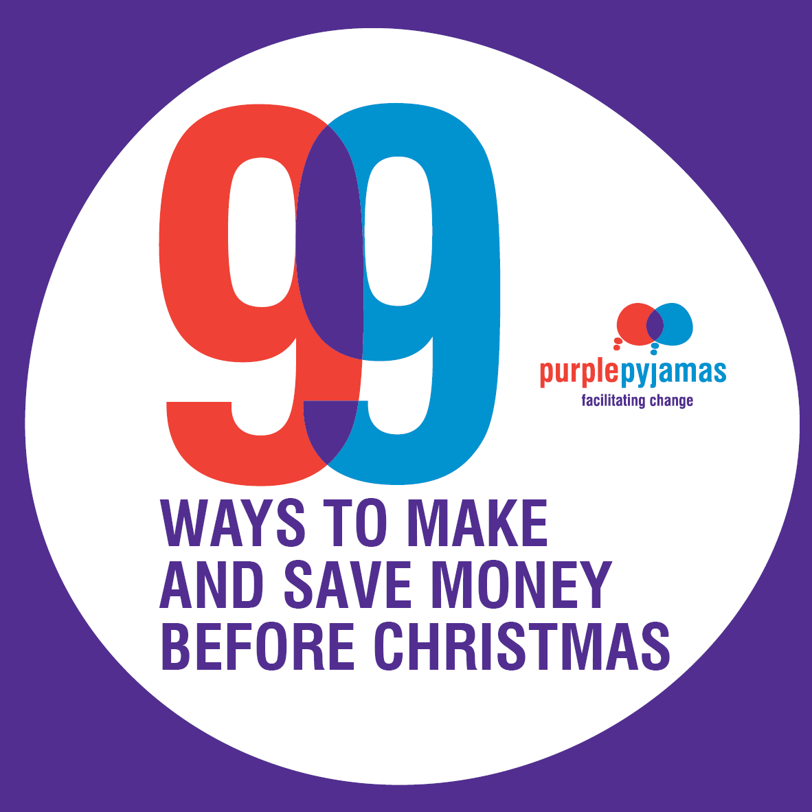
The graphic I developed integrates the concepts of ideas and working together, with overlapping red and blue thought bubbles (that are a quasi ‘p’-shaped). Where the two connect, facilitating change, they become purple.
The vibrant colours and organic shapes provide an interesting and identifiable visual brand. I have an ongoing relationship with Purple Pyjamas and have designed their stationery (business cards, notepads and notecards, Word and PowerPoint templates), as well as workbooks, flyers, posters, ads and social media graphics.
Find out more about Purple Pyjamas at purplepyjamas.com.au.
“The name Purple Pyjamas came from the idea business owners should earn money while they sleep. My ethos is that change happens together. Maybury Ink created a logo that represents this change by bringing together the red and blue. So clever!”