Blackwell Short Lawyers
/ click an image to view gallery
Project outline
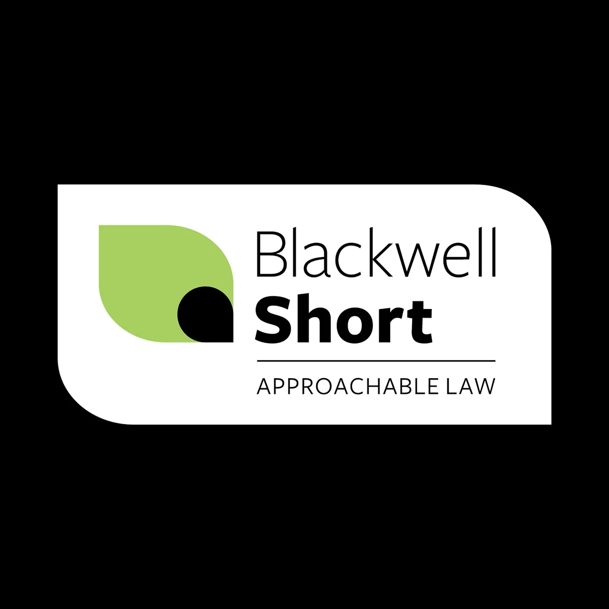
Blackwell Short Lawyers engaged me to design a new logo and visual brand for their business. They had a conservative, generic logo and look, and wanted to make a radical change to modernise their image to reflect their work and style of practicing law. In our initial brand meeting we discussed this, determining they are professional yet friendly and accessible, they listen to client needs, provide effective, practical advice, and deliver the best outcomes. We identified the theme ‘approachable law’, and this became their tagline.
The design concepts I created focused on simple, organic shapes to reflect the friendly and approachable personality. The peacock concept selected represents guidance and protection.
In terms of colour, black was an obvious choice, with ‘Blackwell’ in the name. Black is also associated with protection and authority. And green is one of the many beautiful colours associated with peacocks with connotations of harmony, peace and stability, as well as the colour being a strong differentiator to other local law firms.
I designed a range of branded collateral for Blackwell Short including business cards, letterhead template, street signage and banners for Facebook and LinkedIn. I also wrote their LinkedIn company bio and the bio for Director Anthony Short.
Blackwell Short are located in Orange, NSW.


